
For all you people who think fonts don’t matter … well, you’re usually right, but not always. They do, and not just because choosing the wrong one might cause Ryan Gosling significant mental distress.
They matter a lot to people who have to read pages and pages of frequently dull legal text and need that text to be highly legible. People like Judge Frank Easterbrook of the U.S. Court of Appeals for the Seventh Circuit, for example.
AsymaDesign v. CBL was a pretty straightforward case. AysmaDesign was an Illinois LLC until it went out of business and dissolved in 2017. If it was dissolved that long ago, you may be asking, how could it be a party to an appeal in 2024? Good question. Turns out the case had been filed not by the LLC but by its owner and sole member, George Asimah. He claimed the business lost its lease because its landlord discriminated against him. But he personally was not the leaseholder—the LLC was, which is kind of the whole point of creating a business entity—so the district court held he didn’t have standing. He added the LLC in an amended complaint, but because it no longer existed and so much time had passed, that didn’t help. Case dismissed.
AsymaDesign, LLC, then filed a notice of appeal, and I think you can see or will quickly guess the problem with that. The notice was signed by George Asimah, which meant someone who isn’t a lawyer was trying to represent a business entity that doesn’t exist. Although it somehow seems to have hired a lawyer to represent it, because the court says that “[a]t oral argument its lawyer assserted that, under Illinois corporate law, any person may represent a corporation.” (Emphasis added.) But as the court held, that’s wrong for at least three reasons: (1) this is an LLC, not a corporation; (2) the state law seems to cover transactions but not litigation; and (3) the state law doesn’t apply in federal court anyway. Affirmed in just three pages.
But—in what I guess you might call a twist ending—the opinion went on. “We are publishing this opinion,” Easterbrook wrote for the panel, “not just to make these obvious points but also to urge all lawyers to read and follow this circuit’s Practioner’s Handbook for Appeals….” In addition to other helpful tips that AsymaDesign’s lawyer might need, he noted, it “contains some important advice about typography.”
How could advice about typography be important? Well, it can be, especially if the advice someone needs is “don’t write a brief in the font they used for The Twilight Zone credits.”
There’s good general advice on the topic in the court’s handbook, and even better advice in Matthew Butterick’s Typography for Lawyers, which I’m going to suggest you buy even though he also makes much of it available for free on the web. Part of that advice involves the goal of helping judges, who are “long-term consumers of lengthy texts,” read and remember the arguments you’re trying to convince them to agree with.
AysmaDesign’s lawyer, Easterbrook wrote, “did not heed this advice.” And he didn’t just do something kind of boring like use Arial, either. No, “[h]is brief is set in Bernhard Modern, a display face suited to movie posters and used in the title sequence of the Twilight Zone TV show.”
Was that a bad idea? Well, I guess if you think irritating and distracting judges you’re hoping will rule in your favor is a bad idea, then yes. Because it did that here, and Easterbrook showed why by setting part of the opinion in the offending typeface. I can’t reproduce that here except with an image (without buying the font), which I think email subscribers won’t be able to see, so if that’s you, go watch a Twilight Zone episode and then try to imagine a 30-page brief written in the same font as the credits.
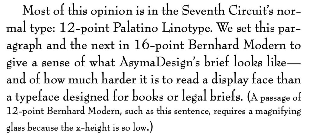
Yikes. Well, at least it wasn’t Courier, which I am pretty sure violates the Geneva Convention, or something insane like Wingdings or even Comic Sans. Still, a poor choice. You shouldn’t be reluctant to reach beyond Times New Roman, which is fine but everybody uses it. But maybe try something like Century Schoolbook (what the Supreme Court uses) or Palatino Linotype (the Seventh Circuit choice). Butterick will tell you all about it.
Nerd.
Is the Twilight Zone font really Bernhard Modern? It sure looks that way, but there are endless variations on fonts. The court says it is, citing Wikipedia, which does say that but doesn’t cite a source of its own. A site called Fonts in Use shows the Twilight Zone as an example of Bernhard Modern, and that looks legit but there aren’t many details. Why don’t I just look up who designed the Twilight Zone credits and answer it that way? Oh, good idea! If they had thought to include an entry on this in the allegedly comprehensive Twilight Zone Encyclopedia, or maybe if the copy of The Twilight Zone Companion I ordered had been delivered on schedule, I would have been able to do that!
Didn’t happen.
I did find a paragraph on the internet claiming that “the Twilight Zone’s memorable font was designed by ITC typeface designer Albertus ‘Al’ Eckhardt,” and that “Rudolf Koch’s Fraktur script was Eckhardt’s inspiration for the font’s elongated and angular design, which fit perfectly with the show’s eerie and mysterious themes.” Maybe, but again there are no cites, “Albertus Eckhardt” sounds like a medieval alchemist, and “Fraktur” seems to be a general name for Germanic script that goes way back, not something invented by one dude. So I suspect that paragraph might be AI-generated bullshit of the type that is swiftly polluting the internet and am not linking to the source.
When my Twilight Zone Companion gets here I will take another stab at this question (nerd), but in the meantime, as the court put it, “[w]e hope that Bernhard Modern has made its last appearance in an appellate brief.”